The 30-Minute City
Small changes in infrastructure could yield major benefits for pedestrians
In my home city of Sydney, Australia, the average speed of travel by car is about 20 mph after considering traffic signals and congestion. On highways in rural areas outside the city, the average speed is three times that (60 mph). Yet despite Sydney’s congestion, rational people pay a pretty dear price to live in it, compared to what it would cost to live in rural Australia. Sydney, like many cities, is valuable for reasons other than ease of driving. What it offers is access.
Cities are organized so that many people can reach one another, and important destinations, in a short amount of time, whether on foot, or by bike, bus, train, ferry, or car. The most accessible cities maximize the destinations people can reach in a reasonable amount of time, even at modest speeds. Outside cities, travel speed, particularly by automobile, tends to be higher, but people and places are also farther apart.
Planners and urban designers recognize that automobiles have a number of negative effects (wasting scarce space, causing pollution and crashes), and they encourage people to walk more and drive less. Yet cities continue to create and maintain traffic systems that favor people in cars over people on foot. There are many ways to improve this situation, short of eliminating private car traffic from busy urban districts — although that should also be considered.
No one will be surprised to hear that cities seeking to increase access must make wise choices about long-term investments in major transport infrastructure, such as subways or highways. But cities must also make intelligent smaller decisions — about streets, intersections, and transit stops. This article is about those latter decisions: modest, local-level steps that are often overlooked by politicians, planners, and engineers who focus on major infrastructure policies and programs. These small decisions could easily improve accessibility by helping people minimize their travel time while walking or taking public transit. Actions like these could help achieve the “30-minute city.”
Access and Time
I borrow the phrase “30-minute city” from the Greater Sydney Commission, the planning agency for the Sydney region. The commission developed a 30-minute city concept as a centerpiece of its 40-year plan. The aim is for all residents of Sydney to be able to reach one of three important regional centers in less than a half-hour by walking, biking, or public transit (for context, right now the average transit-riding Sydneysider commutes for 62-minutes each way).
The 30-minute city is an example of the cumulative opportunities concept of accessibility, which focuses on how many potential destinations (jobs, schools, stores, doctors, etc.) someone can reach from a particular point in a given travel time (say 30 minutes), by a particular mode, at a certain time of day. The cumulative opportunities approach is a simple and useful way to compare accessibility across different places and times. For instance, we can calculate how many jobs a person boarding transit at 8:00 a.m. in downtown Los Angeles could reach in 30 minutes, and compare that with the number of jobs a transit rider can reach in the same time if they start in downtown Santa Monica instead. Planners can use these standards and others like them (see text box) to develop strategies for creating walkable and transit-friendly cities and neighborhoods.

While 30 minutes is a good measure for the journey to work, other metrics have been proposed for different activities, like shopping or daily living. For instance, the “pint-of-milk test” asks whether you can purchase a pint of milk within a 10-minute walk of your home whereas the “20-minute neighborhood” concept is all about living locally by giving residents the opportunity to access all the services they need within a 20-minute walk, bike ride, or transit trip.
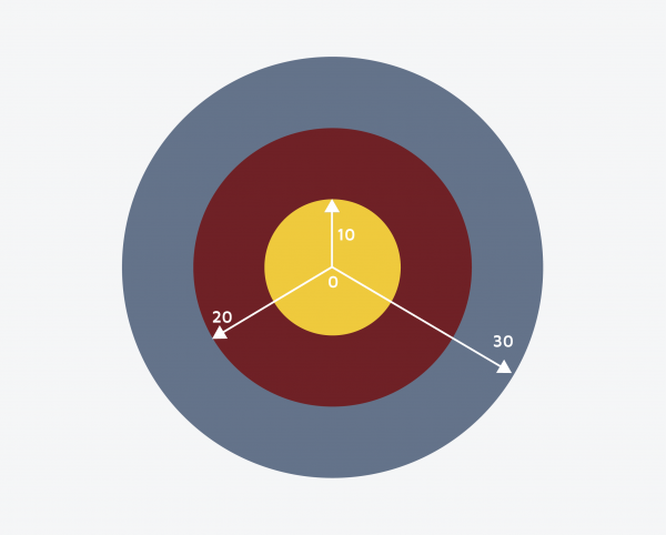
A key point is that minutes, and even seconds, can matter. When the goal is to maximize the opportunities available in a short window of time, shaving off a few seconds here and there adds up to minutes, and saving those minutes can have an outsized impact on overall accessibility. To illustrate, consider Figure 1, which shows the potential area a person could access from a central point if they travel for 10, 20 or 30 minutes. Note that each additional 10 minutes of travel opens up a much larger area and provides access to many more locations. The area of the accessibility ring from 20 to 30 minutes (grey) is much larger than from 10 to 20 minutes (cardinal) and even larger than 0 to 10 minutes (gold).
Figure 1. Accessibility rings
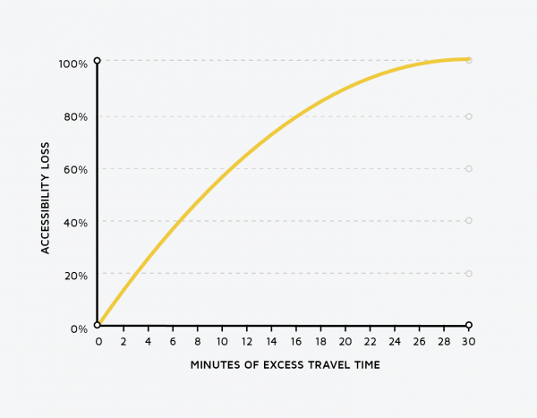
Now imagine that a traveler routinely experiences a 10-minute delay in what would otherwise be a 30-minute trip. That delay costs them more than half of their accessibility, meaning it deprives them not only of time but also of significant opportunities. Figure 2 extends this point and shows that the relationship between travel delay and lost accessibility is non-linear, which means that the first few minutes of delay count more, and the impact diminishes as the delay gets longer. A five-minute delay reduces trip accessibility by 30 percent, but a 10-minute delay costs travelers 50, not 60, percent. The initial minutes of delay cost more. This point brings us back to the importance of seemingly-small decisions.
Figure 2. The estimate of percent accessibility loss
Improving Access to Train Platforms
A simple example of how small decisions can improve overall regional accessibility can be found on the boarding platforms of Sydney Trains, the Sydney region’s 813 km (505-mile) commuter rail system.
Sydney Trains is one of the best commuter rail systems in the English-speaking world, providing high-frequency service from many suburbs to central Sydney. However, 44 of its 175 stations have entrances at only one end of the platform. A traveler approaching from the other end of the platform must walk alongside the station for the full length of the platform, which — given the length of trains — usually takes two minutes. Some unfortunate passengers travel between two stations with gates on only one end of each platform, and a quarter of them face situations where the gates are on the “wrong” end of both platforms. Because minutes matter, this design exacts a heavy toll in accessibility, and probably a heavy toll in ridership. A long history of research, along with a simple dose of common sense, tells us that people who live closer to transit are more likely to use it than those living farther away. People who can see the platform but not get to it (because it has no entrance near them) for all intents and purposes live further away. They have less access and ride less, and this results from nothing but the mismatch of entry and exit locations at the train stations.
Figure 3a provides a real-world example of this problem, by mapping access to Erskineville station, one of the most extreme cases of accessibility loss in the Sydney Trains system. The figure shows five-, 10-, and 15-minute bands of walking time around the station. In 2016, about 1,400 people lived within a five-minute walk (about a quarter-mile) of the station platform.
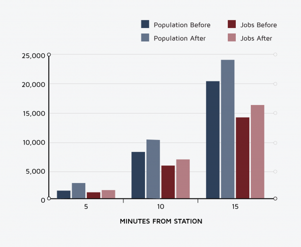
This number would be larger, but many people live or work on the south end of the platform, which is near a number of large apartment blocks. Unfortunately, the station’s only entrance is on the north end. If a southern entrance were added, the number of residents who live five minutes away would increase by 89 percent (Figure 3b). This increase in accessibility should translate into more riders, as well as increased land value and higher real estate tax revenue. Indeed, the second entrance could add enough ridership, and new revenue, to pay for itself.
Erskineville is just one example. Similar interventions could be made for most stations, in Sydney or beyond, that have comparable configurations. Misaligned station entrances are low-hanging fruit that cities can easily pick. The costs are low, the gains are large, and the improvements can be made immediately.
Accessibility comparisons at Erskineville Station before and after potential new station entrance
Figure 3a. Map
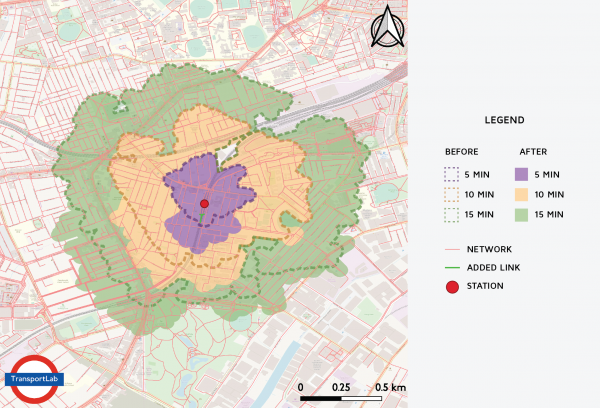
Figure 3b. Changes in population and jobs access
Encouraging Bus Rapid Transit
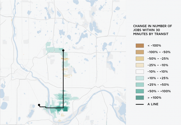
A second example of gaining lots of regional accessibility by saving just a few minutes comes from the Minneapolis-St. Paul A Line, a rapid bus service that opened in 2016. The first rapid bus line of the region’s transit network, the A Line operates from the suburban Rosedale area and connects to both lines of the region’s light rail system. The line is effective, in part, because several seemingly small features allow it to save a few seconds of time for each passenger at each stop, compared to a conventional bus line:
- Prepaid fares: Passengers tap a fare card on the platform before boarding the bus, rather than line up at the front of the bus to tap-in or pay in cash. This saves 1.5–6.0 seconds per passenger.
- All-door boarding: Since they have already paid their fare, passengers can board at any door, not just the front. This cuts the overall boarding time in half.
- Fewer stops: Conventional buses stop roughly every eighth of a mile. The A Line stops every half-mile. Fewer stops result in less time spent slowing down, waiting, and then picking up speed.
A few seconds per passenger, when there are many passengers, adds up to a lot of time saved. Combined, these interventions result in more and quicker trips, even with the same number of buses and hours of driver time. Bus service thus becomes more productive. But does access increase? For the most part, yes. Figure 4 maps neighborhoods near the A Line, and shows whether they gain access to jobs (green) or lose it–because people there now need to walk farther to reach stations (yellow). Most people in the area come out ahead. They have longer walks to stations, but the faster and more frequent buses compensate for that and let people reach more locations in the same overall travel time. Overall, the rapid bus configuration increased job accessibility by 5 percent for local residents. As was the case with Sydney Trains, nothing is particularly unique about this situation. Bus networks in many cities could apply these lessons and make small changes that yield large returns.
Figure 4. Change in number of jobs within 30 minutes by transit
Rethinking Traffic Signals
Here is a final example: traffic signals. Everyone, from a young age, is familiar with traffic signals. But cities installed traffic signals to help drivers, not pedestrians (pedestrians, after all, even in crowds, can navigate around each other without collisions). As traffic proliferated over the last century, signals gave increasing priority to cars, and pedestrian conditions worsened. Pedestrian travel quality has deteriorated because traffic signal engineers have focused more on limiting vehicle delay rather than improving pedestrian accessibility.
Pedestrian travel quality has deteriorated because traffic signal engineers have focused more on limiting vehicle delay rather than improving pedestrian accessibility.
Imagine that a car arrives at an intersection when the light is red. It waits for the light to become green, and then moves on. That period of waiting is vehicle delay. The extent of delay will depend on whether a driver arrives when a signal is red, and how far along the signal is in its red cycle (i.e., did it just turn red, or is it about to turn green?). Engineers consider this delay when they adjust the timing of the signals, and try to maximize the number of cars crossing the intersection while minimizing wait time.
Traffic engineers apply the same treatment to pedestrian crossings, but because it takes longer to walk across the street than to drive, engineers assign pedestrians a longer “yellow” period. For pedestrians, though, these periods are not yellow lights, as they are for cars, but the flashing “don’t walk” signals deter people from starting to cross. As a result of this longer “yellow,” pedestrians get systematically less “green” time than cars. At a typical greater Sydney traffic signal, the light indicates “walk” for as few as six seconds of a two-minute cycle. Any pedestrian who arrives outside that six-second window must wait an average of 57 seconds, and could wait as long as one minute, 54 seconds — much longer than the typical car. (And all this assumes, for some intersections, that the pedestrians pushed a walk light button immediately on arrival, and the traffic signal controller responded promptly to the button being pushed.)
I have estimated that in a typical urban environment, traffic signals impose enough delay on pedestrians to amount to 27 percent of their total trip time. A pedestrian losing 27 percent of their time on a 30-minute walk loses eight minutes. They will now need 30 minutes to reach what they could otherwise reach in 22 minutes. And remember Figures 1 and 2: Even small delays translate to large accessibility losses. In this case, pedestrians losing eight minutes can reach 45 percent fewer opportunities.
Cities could improve traffic-signal timing, and pedestrian accessibility, in some simple ways:
- In a number of cities, including much of Greater Sydney, pedestrian phases aren’t automatic. But they could be. Rather than force pedestrians to push a button to get a signal, cities could have pedestrian phases arrive as a matter of course. The pedestrian could still push a button, but the button would just bring the walk signal sooner, and extend its duration.
- Smart intersections could use existing technology to automatically sense and count pedestrians (not just cars).
- Traffic signals could prioritize pedestrians to give them the maximum rather than the minimum green time.
- Signals could be designed to give pedestrians a leading interval: the walk signal would light up before turning cars get a green light to cross their path. This would increase the visibility of pedestrians because they would already be in the road before cars begin to move.
- Cities could provide more “all pedestrian” phases. These phases are sometimes referred to as a “pedestrian scramble.” Indeed, cities could set some traffic signals to “walk” by default, and only change them to “don’t walk” when enough cars arrive.
These are all things that we could do. If we did them, pedestrians would on average gain accessibility. And since most transit trips start and end with walking, transit accessibility would rise as well. Thus as walking rose, transit use would probably follow. Usually, however, we don’t make these changes, in part because planners and engineers worry about the accessibility losses for automobile travelers, who would have to wait a bit longer. So we systematically design traffic signals to be hostile to people on foot, even as we urge people to walk more and drive less.
Cities Are Made of Places, Not Points
Transportation planners and engineers often represent intersections, transit stops, and even entire communities as dots on a map. They then draw lines between these dots, to connect them with new roads, buses, or trains. While such large-scale plans are important, simply connecting points can also miss crucial details. The small things hidden inside each dot also matter.
Up close, a train station or bus stop is not a point. It’s a place, and we can design it to prioritize efficiency and equity for the passengers, not just the operator. An intersection, similarly, is not a point — it is a space of flows, where people going in different directions, using different modes, come together. How they come together, and who gets priority when they do, should be a focus of policy.
When we blindly focus on big regional plans, we mistake places, small and large alike, as points, and we exacerbate the deep professional chasms that already exist within the transportation community. Engineers and planners have similar objectives when it comes to safety and equity, but often fail to communicate effectively with one another. Maps abstract away details, but the map is not the territory. We have “big thinkers” who focus on the region and fail to consider how small places interact with it, and “bounded thinkers” who focus on small places and neglect the wider community. Understanding that points are also places can let both types of thinkers contribute.
The bias today is toward points, and to thinking about big interventions over small ones. Planners, engineers, and — especially — politicians like to focus on building shiny new things rather than repairing, restoring, and (as I have discussed here) reshaping existing systems. The kind of reshaping I have advocated, which yields incremental time savings, can easily seem trivial, or pointless. But small amounts of time saved do matter at train stations, bus stops, traffic signals, and everywhere else. Small savings add up to large savings, and increase the number of opportunities people can reach in a reasonable amount of time. And accessing opportunities is neither trivial nor pointless. Access to opportunity is why so many people live in cities in the first place.